Showing posts with label pockets. Show all posts

11.09.2010

Purple Reign


Pretty, Pretty Peony Invitation


Modern Monogram Seal


Open Pocket reveals Wedding Invitation, Response Card,
Rehearsal Dinner Invitation & Accommodations Card


Peony font pairs perfectly with Lavender design


Invitation by Marsupial Invitations
Available at Koru Wedding Shoppe


Oh Purple, you are so beautiful & regal. They say you rule in the wedding world. In fact, there are rumors Purple is the new Black. If this gorgeous wedding invitation is any indication, Purple will reign Queen for awhile.

The Purple beauty started with a referral from the Bride's sister who had done her destination wedding invitations at Koru. The Bride's sister was an absolute delight to work with on wedding invitations & the Bride was the exact same delight. She's getting married in May 2011 in Hilton Head Island, South Carolina &, like her sister, she wants pocket invitations for a clean, orderly presentation of the travel information. Unlike her sister, she doesn't want to assemble the invitations herself. Marsupial Invitations it is!

We didn't even have to crack open the invitation book because the Bride spies the perfect invitation displayed in Koru's stationery nook: the Pretty in Yellow & Grey invitation. The colors aren't right & neither are the fonts but otherwise, the design, layout & wording is exactly what she wants. The Bride wants to ask her guests for music suggestions on the response card too (a new fad that I'm loving). Perfect! The Bride easily settles on a Peony purple pocket, Alabaster shimmer paper, Peony font color & Lavender design color. She chooses a pretty script font for emphasis & a clear block font for the copy. It's so stylish I can hardly stand it.

What a lovely purple package. Be still my heart, the Peony Purple invitation is quite a gorgeous sight!


11.04.2010

Invitations: Stuff, Stamp & Mail

Ready to prep for mailing!


Mark your response cards-
it's very helpful if guests forget to fill out their name!


My tissue & stamps

Coming soon: time to mail our wedding invitations!

Our wedding invitations arrived & we took some time to drool over, oops- admire them. There were the fun & games (no, really games!) of getting the correct postage. Finally, the time came to check, assemble, stuff, stamp & mail our wedding invitations.

I cleared the dining room table & carefully laid out my supplies. Laptop. Invitations, response cards, reception cards, accommodations cards & directions cards. Gauzy tissue. Response & outer envelopes. Stamps. Pencils. Scissors although I have no idea what I was going to use those for to mail invitations. I tend to be Type A at times like this & everything was laid out in exact order to leave little room for error.

First, I checked the outer envelope to make sure the guest name & address was correct. Next, I marked the back of the response card with the guest's line number on our Excel spreadsheet. I've heard plenty of nightmares about guests returning their responses with no name & this will help us identify unmarked response cards. Then the invitation pocket was stuffed with a response card, a reception card, an accommodations card & a directions card. (By the way, thank goodness for the pocket to keep things organized- it was RZ's idea!) The response envelope was stamped & placed in the pocket. Then the pocket was checked to make sure all items were enclosed. The gauzy tissue was placed over the invitation, the pocket was closed & invitation was put in the outer envelope. Last but not least, the outer envelope was stamped. I did this over & over- about 100 times!

Ready to deliver our wedding invitations with love!


10.12.2010

6:02pm


As promised, expected & anxiously awaited, our wedding invitations arrived last Wednesday at 6:02pm. Here is the big, brown box that put an instant smile on my face:


I ripped through this adorably-branded packing tape:


And there, nestled among the packing peanuts, were two boxes:


I pulled out the two boxes tied with chocolate brown ribbon:


Inside the boxes were our wedding invitations:


Our perfect, perfect wedding invitations. They're so beautiful (better than I imagined!) & meaningful. We have been carefully & lovingly planning our wedding for eight months & to see our wedding plans in print . . . it feels very real & very official. There it all is, spelled out in detail. This invitation speaks to the promise we've made to each other & the vows we're going to make to each other.

To some, our wedding invitation may just be another piece of paper. To us, it's
the invitation of our lifetime.

9.16.2010

Fast Track


The closed pocket invitation in Snow, Pear & White


I love the quote featured on the pocket seal


The open pocket reveals the invitation & additional inserts


The elegant wedding invitation


Lots of helpful information for the wedding guests!


Pear envelopes add a fun punch of color
Invitation by Marsupial Invitations
Available at Koru Wedding Shoppe

This Bride had three problems. She had a pocket invitation that she didn't love. She & others found the green ink on the invitation hard to read. She needed new invitations done pronto for her wedding at W Hotel Hoboken. Could I help? Not one to back down from a challenge, I agreed to try.

I laid out the requirements & timeframe for the rush job- a two day wait for proofs, a rush fee & overnight shipping fee to receive the invitations two weeks after the proof approval. The Bride said it was fine & we got right to work. The next three days passed in a whirlwind. The Bride selected her new wedding invitation from Wedding Four by Marsupial Invitations & I placed the order. The proof came the next day, along with some bad news- the Lemongrass backer & envelopes the Bride had chosen were no longer available. It's never easy! We waited for the new, green paper samples to be overnighted. The samples arrived, Pear was deemed the winner & the order was approved for printing. Phew!

Two weeks later, just as promised, these beautiful wedding invitation arrived. The White/Pear color scheme is crisp & clean for an elegant look. I adored them, the Bride loved them & everybody was happy. I adore happy endings, don't you?!

9.01.2010

Invitations: check!


We ordered our wedding invitations from this company!
Jennie & Mark invitation from Marsupial Invitations


Yesterday was a red-letter day in our wedding planning: we ordered our wedding invitations!

We were debating between a classic invitation by Monique Lhuillier & a stylish invitation by Marsupial Invitations. Back & forth, back & forth. Then some more back & forth, back & forth. Finally, with patience running thin, we came to a final decision: a pocket invitation by Marsupial Invitations.

How did we arrive at our final decision? Blood, sweat & tears!! Just kidding. What it came down to was me. I'm a creative person who loves designing things, especially stationery whether it's a Mother's Day card or a wedding invitation. It simply made sense to work with a stationery company like Marsupial that allows me the freedom to design our wedding invitation using their paper colors, ink colors, font styles, monograms & images.

I worked really hard over the past two weeks to design a wedding invitation that reflects us as a couple & our wedding. I spent a lot of time on every last detail. I believe I created an invitation that is traditional, yet modern & very us. I'll write more in another post about the creative process. For now, I'm basking in the glory that we ordered our wedding invitations!!!!

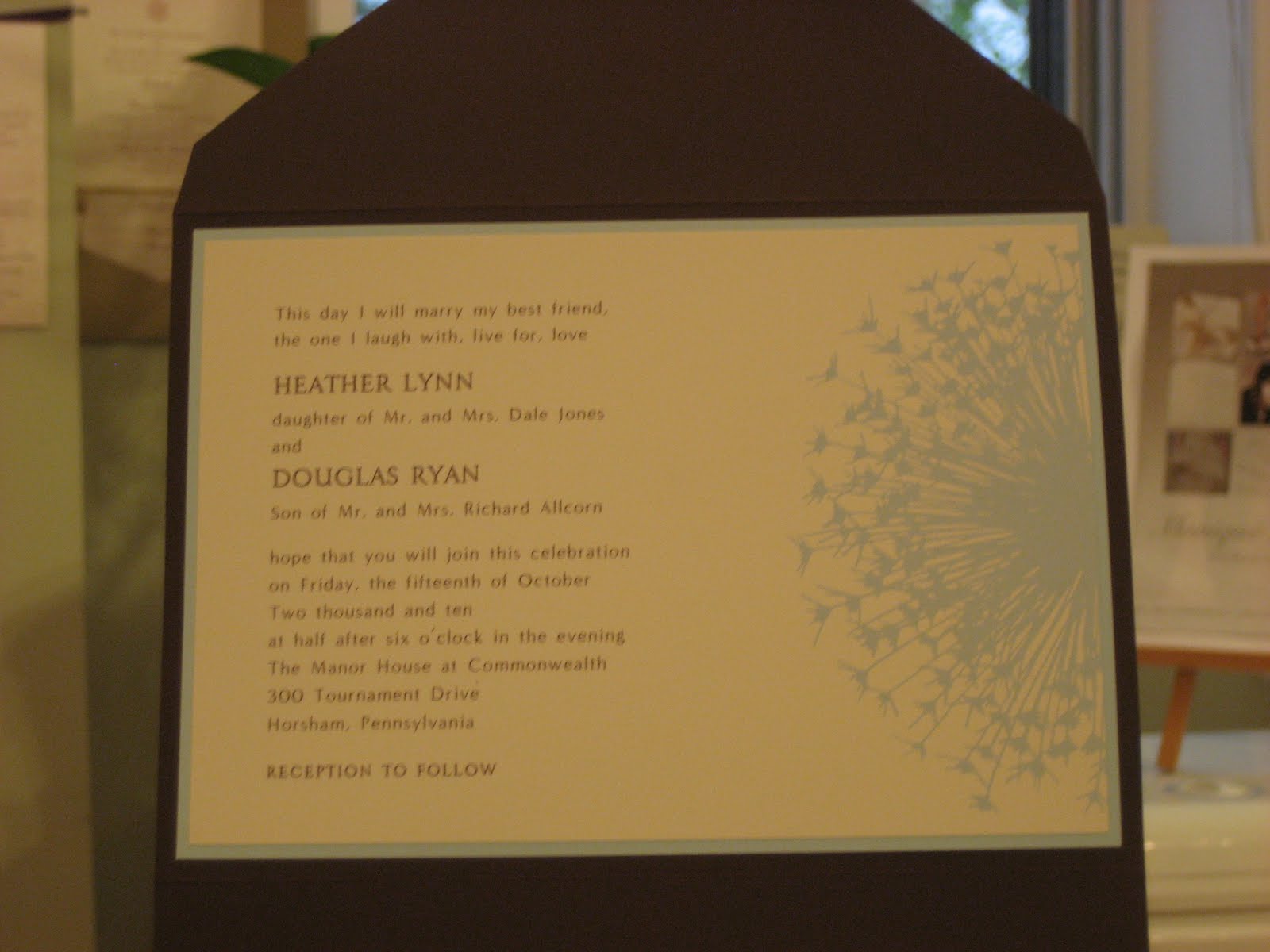
8.26.2010

Just Dandy


The seal offers a peek at the invitation design


The open pocket


Layers of color with the Chestnut pocket, Topaz backer & Ivory invitation


The invitation & response card perfectly match


Just love the dandelion!

For your viewing pleasure, I present you with a beauty from Wedding One by Marsupial Invitations.

The first thing you notice about this wedding invitation is the dandelion motif, very sweet & simple. H & D loved the dandelion from the start but we went through many versions of their invitation before we got it right.

First, the dandelion is available as a complete circle. H & D thought it would take up too much room as a full circle & they had no desire for their copy to be printed over the dandelion. We cut the dandelion in half & placed it to the right side & all was well. Then H & D chose a Chestnut pocket with matching font color & an Ocean backer with matching motif color. Since we met in late January & their wedding wasn't until Fall, we agreed to meet during the Summer to finalize the order.

H came back in July & we reviewed their earlier choices. This time, H wasn't thrilled about the bright blue Ocean backer & matching motif color. She wanted the color scheme to be lighter, softer. She picked the backer in a light blue called Topaz & the motif in a blue-grey called Ash, the closest we could find to Topaz. I placed the order & quickly received an email from the stationer saying they could match the design color to the Topaz backer. Yeah!

And finally, the design process on the dandelion invitation was complete & done. H, D & I are absolutely in love with the final result. This invitation is just dandy!


8.17.2010

Invitations. Seriously.


Will we go the more traditional route?
Monique Lhuiller wedding invitation available at Koru


Or a more modern route?
Marsupial Invitations wedding invitation available at Koru

I was shamed today: a May 2011 Bride ordered her wedding invitations. This Bride was so organized! She had her ceremony, reception, accommodations & rehearsal dinner information. I only have two out of those four. I'm a January 2011 Bride & I haven't ordered our wedding invitations yet. What is wrong with this picture?!

RZ is coming to Koru Wedding Shoppe after work & we are ordering our wedding invitations. You may remember we attempted this a few weeks ago & it simply didn't work out. No ifs, and or buts this time.

Tonight is the Night!

8.10.2010

Pretty in Yellow & Grey Program


A simple ceremony program


The design is copied from the wedding invitation


The pocket wedding invitation that inspired the ceremony program

The Pretty in Yellow & Grey Bride came back to Koru Wedding Shoppe for matching ceremony programs. She was having a short & sweet ceremony & she simply wanted to list the members of the bridal party
who support & love them on not only their wedding day but every day. Naturally, she wanted to design to match her gorgeous wedding invitations. Easy, easy!

The Pretty in Yellow & Grey program is a single sheet with a backer. We used the same paper color, font style & design to match the Bride's wedding invitation. We flipped the layout to a vertical orientation to best fit the copy & added the bridal party list. The result is perfectly coordinated ceremony program.

Very simple; very striking!

6.25.2010

Golden Splendor

A new twist on the pocket invitation
The invitation & enclosures are tucked away in the pocket


The invitation features an embossed pattern & a printed flourish


A close-up of the flourish decoration


The invitation & its matching enclosures

The Golden Splendor invitation is modern & old-fashioned at once. The shimmer, champagne pocket is an updated version of the popular pocket invitation. The square shape, shimmer paper, almond ink & combination fonts are marks of a modern invitation. Yet the graceful filigree pattern gives the invitation a classic, elegant feel.

As you've gathered from previous invitation posts, many Brides see the sample shown in the stationery book or sample displayed at Koru Wedding Shoppe & customize it to make it their own. The Bride & Groom who chose this invitation took it exactly as is- font style, font color, layout, etc. The only thing they changed is the wording. They thought it was ideal for their vintage-theme wedding. Sometimes things are perfect as is!


6.21.2010

Pretty in Yellow & Grey


A pocket invitation done in Mercury, Daffodil & Ivory
Notice the modern monogram!


The invitation features one of the most popular designs at Koru


For a pop of color, the outer envelope & response envelope are Daffodil


I love that the Bride & Groom ask their guests for music suggestions

The Pretty in Pink invitation showcased here spends its days garnering much attention in the front window of Koru Wedding Shoppe. Before Pretty in Pink was moved to that illustrious spot, it was displayed in Koru's stationery nook. Pretty in Pink inspired many Brides & Grooms, including the lovely couple's invitation showcased today.

The Bride & Groom liked the basic look of Pretty in Pink but they felt it was too traditional & soft for their wedding. Well, well, of course we can help! First, we picked colors that fit with the couple's wedding- Mercury grey, Daffodil yellow & Ivory. Then, we flipped the invitation to a horizontal layout. Followed up with clean, block fonts, the look was complete. The final touch was a cool monogram chosen for the pocket seal. Love, love!

Much like the Orange You Happy's pocket, the bright yellow outer envelope for this invitation puts an instant smile on your face. It's so bright & happy!

All in all, the Pretty in Yellow & Grey invitation is formal yet modern & edgy.

I love when a Bride & Groom are inspired by another couple's wedding invitation & they manage to make it their own. Can you believe Pretty in Yellow & Grey has already inspired another couple? That invitation will be featured soon :-)

6.16.2010

Orange You Happy


The closed pocket in the happy color of Sunset


The seal introduces the invitation's design & color scheme

The invitation in its full glory


This pocket bucks the trend with its vertical layout


The invitation & its matching enclosure

I liken the day wedding invitation orders arrive at Koru Wedding Shoppe to birthdays. The brown shipping box looks just like a wrapped present to me. I eagerly cut away tape, toss aside packing supplies & search for the long-awaited gift, aka the wedding invitation sample. It's a wonderful surprise each & every time.

Today's arrival from Wedding Four by Marsupial Invitations was no exception. I opened the shimmer Magnolia envelope to find the Sunset pocket invitation inside & I couldn't help smiling. That bright, happy burst of orange will do that to you! From there, it just got better & better. The Ash swirl designs & Copper combination font of a clear, script & a clean block keep the invitation set from being too cute or informal. The design & fonts are consistent on the pocket seal, the invitation & the response card. Love, love the strong color combination & modern design!!

Do you remember when I wrote about two brothers who designed & purchased their wedding invitations at Koru Wedding Shoppe? The first brother's classic pocket invitation was featured here. The second brother's wedding invitation is shown above! How cool that they came to the same store, chose from the same invitation company & created two distinct looks?!

5.19.2010

Love Beach


A beautiful pocket invitation for a wedding in the Bahamas


The invitation & enclosure cards provide plenty of info for the traveling guests


The shell & marine ink reflect the wedding's location

I can't help it: I feel the need to escape to sunny days, warm breezes, white sands & turquoise waters. Thankfully, I've done a rash of destination wedding invitations lately so there are plenty of opportunities to visit to the tropics, even if it's only on a blog post. Today, we're going to the Bahamas!

What do you think of when you hear Bahamas? I, for one, immediately think of the gorgeous, turquoise waters. This wonderful couple had the same idea & they chose Marine ink to reflect those ocean waters (unfortunately, Marine looks dark in my photos). It's perfect for a destination wedding in the Bahamas. Just add the whimsical seashell on the ecru invitation enclosed in a shimmer, champagne pocket & perfection is achieved! Did I mention that their outer envelopes were addressed in Marine ink too? Seriously, it doesn't get better than this invitation.

Or maybe it does. The Bride & Groom are getting married at sunset on Love Beach in the Bahamas. How romantic!!!!


3.04.2010

Pearl Pocket


The closed Pearl Pocket invitation with its cover design


This baby stands on its own!


Inside, the invitation is classic


The four enclosure cards are stacked neatly in the pocket


A glimpse at the enclosure cards designed to match the look of the invitation

In January, a Bride came to her invitation appointment armed with her friend's classic pocket invitation done at Koru Wedding Shoppe. The Bride loved her friend's pocket invitation (soon to be featured on this blog!) but she was concerned about choosing the same wedding invitation as her friend. Out came the Pockets album which is divided between classic pocket invitations & unique pocket invitations. The Bride spent the most time looking at the unique pocket options & eventually settled upon the Pearl Pocket invitation shown above.

The Pearl Pocket invitation features a pearl shimmer folder with a 'window' showcasing the Bride & Groom's names. Inside, there is an ecru invitation & a pocket holding four ecru enclosure cards. Why four enclosure cards? In addition to the standard response & reception cards, the Bride needed accommodations & directions cards for her out-of-town guests. Pocket invitations keep all the wedding information in one tidy place. The Bride selected a traditional black script font to keep her invitation formal. Take a look above at her pocket wedding invitation!

This is the first time I have ordered a unique pocket invitation & I was impressed with the overall look. The sample is displayed at Koru & it's gotten a lot of attention. By now, most of us have seen the pocket invitation done again & again. The pearl pocket invitation is different & beautiful, a sure hit with wedding guests!
Related Posts Plugin for WordPress, Blogger...