skip to main |
skip to sidebar

To be honest, it's very, very difficult for me not to share every last detail of our winter wedding with you. I'd love to post a photo of my wedding dress, our wedding invitations, our cake, etc. It's so tempting! Then I remember it's most important for our treasured wedding guests to be surprised & delighted at our wedding. After our quickly-approaching wedding, I will have plenty of time to share with you. Reason wins.
Mostly.
Except for the flowers. Planning & creating our modern, winter white wedding look with my fabulous florist Liz has been one of the most enjoyable parts of wedding planning. Then to not be able to share any of the details . . . so unfair! I have been bursting to show you our perfect, sample centerpiece ever since I laid my eyes on it. But I resist.
Then I stumbled upon the above photo of a simple, white carnation bouquet on Hey Gorgeous! yesterday. I couldn't resist the golden opportunity. After all, I have written about my love for underrated carnations & my plan to use carnations for our wedding so I can say a little more. Right? This isn't an outright sneak peek, it's more like a sneak hint. Our wedding will feature flowers similar to the photo above from the bouquets to the ceremony to the reception. Sweet & romantic.
That's all I can write & show you for now!
 Pretty, Pretty Peony Invitation
 Modern Monogram Seal
 Open Pocket reveals Wedding Invitation, Response Card,
Rehearsal Dinner Invitation & Accommodations Card
 Peony font pairs perfectly with Lavender design
Oh Purple, you are so beautiful & regal. They say you rule in the wedding world. In fact, there are rumors Purple is the new Black. If this gorgeous wedding invitation is any indication, Purple will reign Queen for awhile.
The Purple beauty started with a referral from the Bride's sister who had done her destination wedding invitations at Koru. The Bride's sister was an absolute delight to work with on wedding invitations & the Bride was the exact same delight. She's getting married in May 2011 in Hilton Head Island, South Carolina &, like her sister, she wants pocket invitations for a clean, orderly presentation of the travel information. Unlike her sister, she doesn't want to assemble the invitations herself. Marsupial Invitations it is!
We didn't even have to crack open the invitation book because the Bride spies the perfect invitation displayed in Koru's stationery nook: the Pretty in Yellow & Grey invitation. The colors aren't right & neither are the fonts but otherwise, the design, layout & wording is exactly what she wants. The Bride wants to ask her guests for music suggestions on the response card too (a new fad that I'm loving). Perfect! The Bride easily settles on a Peony purple pocket, Alabaster shimmer paper, Peony font color & Lavender design color. She chooses a pretty script font for emphasis & a clear block font for the copy. It's so stylish I can hardly stand it.
What a lovely purple package. Be still my heart, the Peony Purple invitation is quite a gorgeous sight!
 Ready to prep for mailing!
 Mark your response cards-
it's very helpful if guests forget to fill out their name!
 My tissue & stamps
Our wedding invitations arrived & we took some time to drool over, oops- admire them. There were the fun & games (no, really games!) of getting the correct postage. Finally, the time came to check, assemble, stuff, stamp & mail our wedding invitations.
I cleared the dining room table & carefully laid out my supplies. Laptop. Invitations, response cards, reception cards, accommodations cards & directions cards. Gauzy tissue. Response & outer envelopes. Stamps. Pencils. Scissors although I have no idea what I was going to use those for to mail invitations. I tend to be Type A at times like this & everything was laid out in exact order to leave little room for error.
First, I checked the outer envelope to make sure the guest name & address was correct. Next, I marked the back of the response card with the guest's line number on our Excel spreadsheet. I've heard plenty of nightmares about guests returning their responses with no name & this will help us identify unmarked response cards. Then the invitation pocket was stuffed with a response card, a reception card, an accommodations card & a directions card. (By the way, thank goodness for the pocket to keep things organized- it was RZ's idea!) The response envelope was stamped & placed in the pocket. Then the pocket was checked to make sure all items were enclosed. The gauzy tissue was placed over the invitation, the pocket was closed & invitation was put in the outer envelope. Last but not least, the outer envelope was stamped. I did this over & over- about 100 times!
Ready to deliver our wedding invitations with love!
 November is the month to be thankful so we're going to kick off with a thank you note feature.
You may remember the Fast Track Bride who needed (& got!) her wedding invitations in a hurry. It's hard to believe but her wedding is mere days away. Luckily, her thank you notes arrived in the nick of time. They're ready & waiting for the happy couple to get married, enjoy their honeymoon & return to thank their wedding guests.
The thank you notes are simple, sweet & match the wedding invitations flawlessly. The Bride chose to have their first names in the same script font & same Lime font color on the front of the thank you card. The Pear outer envelope picks up the Lime font color & adds a burst of color to the thank you notes. Instead of choosing the Snow shimmer paper or the White matte paper from her wedding invitations, the Bride selected the Frost card stock. Frost has a subtle texture to make things interesting. The result? The perfect thank you note.
Cheers to love, laughter & happily ever after for the Bride & Groom~
Let's face it: I love anything & everything stationery. This means I've been known to drool over an outer envelope addressed in gorgeous calligraphy. True story. So it was a huge surprise that I didn't care about the addressing of our wedding invitation envelopes. I considered writing them myself since I have nice handwriting. However, I'm a bit of a perfectionist & I knew the pressure to write beautifully in a straight line would be too much. That idea was quickly scrapped. The next option was hiring a calligrapher & I happen to know Hoboken's best calligrapher, Diane of Inksong Calligraphy. But now that I see much in terms of budget, budget, budget, skipping calligraphy seemed like an easy way to save a few bucks. Not to mention, I was not taking the time to have our envelopes hand-canceled to ensure that gorgeous calligraphy wasn't ruined in the mail.That's the long way of saying we opted to have our Snow white envelopes addressed by Marsupial Invitations. Many stationers offer computer calligraphy at a low cost. We filled out a template, sent the template with our order & our wedding invitations arrived with addressed envelopes. Pretty cool, right? We chose the same formal script & the same Taupe font color used on our wedding invitations. Everything coordinated perfectly without spending a fortune; we were pretty pleased.The downside? You're on your own for changes & additions. For example, I discovered we had spelled one of our guest's names wrong. Also, one of our guests moved between the time we submitted the order & we received the order. I can't exactly send our envelopes back to California & have a few envelopes done. So I'm on my own for any extra envelopes we need addressed. Thankfully, we were smart enough to order plenty of extra envelopes (always, always order extra envelopes!!!). And, well, my nice handwriting comes in handy!
 Patience, patience: Blah, Blah
Print available at Etsy from TheTwitterpatedToad's shop
This is what UPS has to say on the matter: Out For Delivery.Good things come to those who wait. Patience is a virtue. Whatever!
Normally I'm a patient person. Not today! Not on the BIG day that our wedding invitations arrive at Koru Wedding Shoppe!! I can't wait to tear open that brown box & see our wedding invitations!!! I have watched the magical moment when a Bride holds her wedding invitation in her hands & reads it for the first time; it's such a special, quiet moment. Now it's my turn :-)Don't mind me as I sit here & count the hours, minutes & seconds until the package arrives . . .
 Vintage Mailbox
Available at lindaleann's shop on etsy
The notification came late Wednesday night. An 18-pound box from Marsupial Invitations was headed to Koru Wedding Shoppe to arrive on October 6. Could this shipment be our wedding invitations?!!!!!!!!
I casually mentioned to RZ that our wedding invitations could be, right this very second!, on their way to us. RZ tends to maintain his cool at all times, unless the Yankees or Jets are involved, & he flippantly answered that's nice. Since I had no confirmation yet, I tried to match RZ's cool. It became clear to me that there was absolutely no way I was waiting until October 6 to find out what the box contained. I fired off an email to Marsupial Invitations to confirm the shipment was ours.The next day, I had everything I needed to know: It's your invites!!!
Cue the Happy Dance. I can't wait to see our wedding invitations!!!!
 The closed pocket invitation in Snow, Pear & White
 I love the quote featured on the pocket seal
 The open pocket reveals the invitation & additional inserts
 The elegant wedding invitation
 Lots of helpful information for the wedding guests!
I laid out the requirements & timeframe for the rush job- a two day wait for proofs, a rush fee & overnight shipping fee to receive the invitations two weeks after the proof approval. The Bride said it was fine & we got right to work. The next three days passed in a whirlwind. The Bride selected her new wedding invitation from Wedding Four by Marsupial Invitations & I placed the order. The proof came the next day, along with some bad news- the Lemongrass backer & envelopes the Bride had chosen were no longer available. It's never easy! We waited for the new, green paper samples to be overnighted. The samples arrived, Pear was deemed the winner & the order was approved for printing. Phew!
Two weeks later, just as promised, these beautiful wedding invitation arrived. The White/Pear color scheme is crisp & clean for an elegant look. I adored them, the Bride loved them & everybody was happy. I adore happy endings, don't you?!
 Created by the Bride
 The Mercury envelope adds a touch of color
This Bride claimed (*) she did not have a creative bone in her body, yet she was determined to create her wedding invitation on her own. She chose to work with the Wedding Four by Marsupial Invitations book & she didn't want her invitation to look exactly like any of the samples shown. I explained the endless options available, then sat back & relaxed (**) while she did the dirty work of making the perfect invitation for her wedding.
Now look at the final results: a sleek, sophisticated invitation. *If she didn't consider herself creative before, she may have to change her non-creative motto after this beauty. The Bride picked a square invitation with a Mercury backer, Magnolia printed layer, Mercury ink, a Lavender graphic & combination lettering. The outer envelope was Magnolia & the response card envelope was Mercury for a fun punch of color. All in all, the wedding invitation speaks of a formal, classic affair.
Not only did the Bride create a gorgeous wedding invitation, she made a great suggestion about our shared venue. The hotel used to be known as the Hyatt Regency Jersey City. Recently, it's become Hyatt Regency Jersey City on the Hudson. Phew, it's wordy! However, the "on the Hudson" addition is nice because it details the waterfront location. The Bride simplified it to Hyatt on the Hudson. Simple & sweet. I stole her good idea for our wedding invitations!!
**I didn't let this Bride flounder as she worked on her wedding invitation- I was there at all times to offer my advice & opinion. Still, she gets the credit for her pretty invitation!
 The Koru necklace that . . .
launched my business
and inspired our wedding invitation!
 The beautiful logo of Koru Wedding Shoppe
I love swirls. I bought my gorgeous, swirl necklace years ago simply because I liked it. As I learned more about the legend of Koru & the swirl associated with it, I quickly went from like to love. So much so that I named my business Koru Wedding Shoppe & picked a swirl for the logo. Don't worry, I didn't slap Koru Wedding Shoppe's logo on our wedding invitation. I wouldn't go that far.
However, Wedding Four by Marsupial Invitations offers awesome, swirl graphics. Those swirl graphics are shown on sample invitations throughout the book; none of the samples were quite right for us. I flexed my creative muscles, picked two swirl graphics & created a wedding invitation. This may be the most fun I've had to date while wedding planning. I adore the swirl designs on our wedding invitation & I love that they represent the inspiration & celebration of our positive new beginning. Beautiful & personal.
By the way, I had designed said invitation before we'd decided between Monique Lhuillier & Marsupial Invitations. I never said I was following the book step-by-step in this wedding planning process.
Boy, what sweet relief to check one thing off our wedding timeline- invitations done!
I already explained how we chose our wedding invitations. The Olivia & Edward invitation was the invitation we chose as far as the basic shape & overall look; we had a lot of work to do to make it our own. What was the next step? Choosing paper colors. One of the things I adore about Marsupial Invitations is they offer a rainbow assortment of paper colors. We could choose from the color options for our pocket, envelopes & printed layers.
Our wedding theme is a winter white wedding with white, cream & champagnes with a touch of purple. Thank goodness for a theme because it truly makes decisions easy- simply choose things that work within your theme. RZ declared there would be absolutely no purple on the wedding invitation. My stipulation was that some or all of our paper colors had to be shimmer papers because I'm semi-obsessed with the touch of shimmer. So we had the white, cream & champagne family of shimmer & matte options to work with for our wedding invitation.
I played & played with the paper swatches until I had the ideal combination: Frost, Snow & Magnolia. Perfect names for a winter wedding, right? I swear, it's coincidental. We picked Frost, a textured, white matte paper for our pocket. Even I realized there is such a thing as too much shimmer. Next is Snow, a pure white, shimmer paper, chosen for the outer envelope & response card envelope. Finally, Magnolia, a cream, shimmer paper for the printed layers. Together, Frost, Snow & Magnolia are a beautiful winter combination.
Stay tuned to find out how we chose the image for our wedding invitation!
Yesterday was a red-letter day in our wedding planning: we ordered our wedding invitations!
We were debating between a classic invitation by Monique Lhuillier & a stylish invitation by Marsupial Invitations. Back & forth, back & forth. Then some more back & forth, back & forth. Finally, with patience running thin, we came to a final decision: a pocket invitation by Marsupial Invitations.
How did we arrive at our final decision? Blood, sweat & tears!! Just kidding. What it came down to was me. I'm a creative person who loves designing things, especially stationery whether it's a Mother's Day card or a wedding invitation. It simply made sense to work with a stationery company like Marsupial that allows me the freedom to design our wedding invitation using their paper colors, ink colors, font styles, monograms & images.
I worked really hard over the past two weeks to design a wedding invitation that reflects us as a couple & our wedding. I spent a lot of time on every last detail. I believe I created an invitation that is traditional, yet modern & very us. I'll write more in another post about the creative process. For now, I'm basking in the glory that we ordered our wedding invitations!!!!
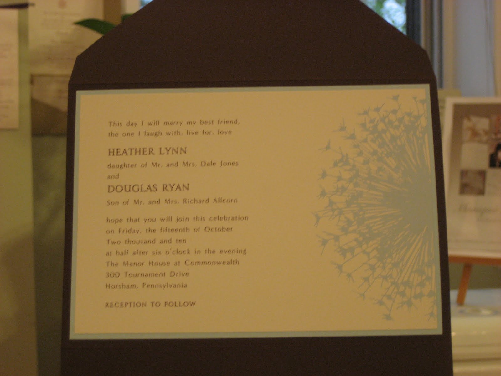
 The seal offers a peek at the invitation design
 The open pocket
 Layers of color with the Chestnut pocket, Topaz backer & Ivory invitation
 The invitation & response card perfectly match
 Just love the dandelion!
The first thing you notice about this wedding invitation is the dandelion motif, very sweet & simple. H & D loved the dandelion from the start but we went through many versions of their invitation before we got it right.
First, the dandelion is available as a complete circle. H & D thought it would take up too much room as a full circle & they had no desire for their copy to be printed over the dandelion. We cut the dandelion in half & placed it to the right side & all was well. Then H & D chose a Chestnut pocket with matching font color & an Ocean backer with matching motif color. Since we met in late January & their wedding wasn't until Fall, we agreed to meet during the Summer to finalize the order.
H came back in July & we reviewed their earlier choices. This time, H wasn't thrilled about the bright blue Ocean backer & matching motif color. She wanted the color scheme to be lighter, softer. She picked the backer in a light blue called Topaz & the motif in a blue-grey called Ash, the closest we could find to Topaz. I placed the order & quickly received an email from the stationer saying they could match the design color to the Topaz backer. Yeah!
And finally, the design process on the dandelion invitation was complete & done. H, D & I are absolutely in love with the final result. This invitation is just dandy!
I was shamed today: a May 2011 Bride ordered her wedding invitations. This Bride was so organized! She had her ceremony, reception, accommodations & rehearsal dinner information. I only have two out of those four. I'm a January 2011 Bride & I haven't ordered our wedding invitations yet. What is wrong with this picture?!
RZ is coming to Koru Wedding Shoppe after work & we are ordering our wedding invitations. You may remember we attempted this a few weeks ago & it simply didn't work out. No ifs, and or buts this time.
Tonight is the Night!
The time is here for RZ & I to choose our wedding invitations!!
I have been looking forward to this moment since we got engaged. At Koru, one of my very favorite things is helping couples with their wedding invitations. Naturally, it will be all the more fun & enjoyable to choose & design our wedding invitations.
Well, the choosing may not be as easy as I thought. I'm pretty torn. Do we go with a classic invitation with a modern twist, much like the Monique Lhuillier wedding invitation shown above? Or do we get a bit more creative & design something more stylish & unique, much like second wedding invitation above by Marsupial Invitations? I have my eye on two wedding invitations that both match the style & formality of our wedding, yet they are very different wedding invitations.
RZ is coming to Koru later today to help me with the great invitation debate. Who knows- maybe there is a third option that I haven't considered!